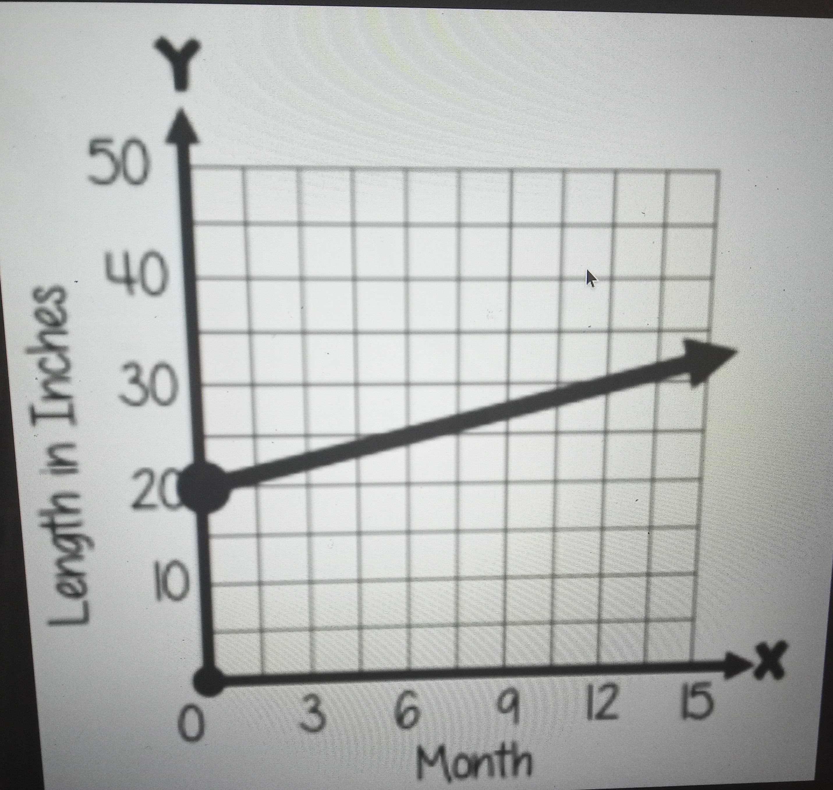
The graph shows the average length (in inches) of a newborn baby over the course of its first 15 months. Interpret the RATE OF CHANGE of the graph.
Looking at our graph, we have a straight line. For straight lines, rate of change equals slope.
Looking at a few points, we have:
(0, 20), (12, 30)
Using our slope calculator for these 2 points, we get a slope (rate of change) of:
5/6
Looking at our graph, we have a straight line. For straight lines, rate of change equals slope.
Looking at a few points, we have:
(0, 20), (12, 30)
Using our slope calculator for these 2 points, we get a slope (rate of change) of:
5/6